Business Tech: UI/UX Part V
Next issue we'll get on to a new topic, however, I do have some final thoughts to share on User Interface (UI) and User Experience (UX).
Help Doc!!!
UI/UX isn't just about coding. While it is nice to add screenshots to a help document, I like to go a step further and use a little bit of HTML to create flipbooks.
Like a wizard, which guides you through a process, a flipbook is a series of pages which act like a walk-through for your software. Emphasizing the visual by making the screenshots the centerpiece of the help, instead of just tacking them on at the end, speeds up comprehension. If we want our work to be appreciated, we need to make the people who use it successful.
Of course, because we create flipbooks in HTML, adding links to related help, or to online resources becomes trivial. The goal with help, as it is with software, is to make things work in a way which makes sense.
Suspect is Mail
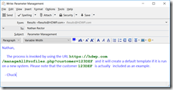
While the program you create and receive email with has a UI/UX aspect, the mail itself can also benefit from a little kansei engineering. I routinely have to write e-mails which refer to business concepts and contain example code or commands. I write the computer parts in twelve-point Courier New using green, bold letters. This sets it apart from the rest of the document in a way that the reader can immediately discern.
I use this technique for all code and commands, not just MultiValue. Remember, most people outside of our industry don't see HTML, Java, mvBASIC, or Swift as different from each other. Simply marking the code as code is a way for the people who don't understand to know what to ignore. The few recipients on the e-mail who care about the code have what they need. The others don't feel excluded from the chain, as they might if we were to start sending different e-mails to different groups.
I do the same when I have to paste in outputs (reports, totals, etc.). This has the added benefit of making columns line up because Courier New is a
mono-spaced font. Making documents more easily readable improves the user experience
Figure 1
If you don't see why formatting is so important, take a moment to review the approach we take to this magazine. Tracey does an amazing job of directing your eyes where they need to go by providing a clean, clear, and consistent layout. She keeps your interest by changing up a reasonable amount of things between issues. Not everyone happens to have a background in layout, but we can all make an effort to craft our written communications. Effective transfer of knowledge isn't just about words. White space, length of sentences, even your choice of punctuation, they all add to the results.
Clear and Presentations
What goes for text goes for verbal communication. Separating the parts of your presentation to meet each audience segment maximizes the value of the time everyone spends listening to you.
If you know that the V.P. attending your meeting is likely to get pulled out for a call, you should load what they need into the early part of your talk and let the rest wait. If you know that the engineers are perpetually late, move the bits critical to them into the middle. I often arrange my timeline based on attention spans. I know who is likely to tune out and who is likely to take a while to warm up to the topic.
Hard Stop
Taking UI/UX beyond software includes factoring in hardware. Some of us older folks remember when you could buy PC keyboards with special keycaps that told you which word processing shortcuts were enabled by which keys. While ordering a Word Perfect or Microsoft Word keyboard has fallen out of fashion, adding a laminated page to the keyboards your IT team provides might make everyone's job easier. Data Entry could get their cheat-sheet and a different page could be attached for Finance and yet another for the Receiving Dock.
I've even seen shops where additional physical controls have been added to PCs to do tasks which could have been done with key combinations. They do it because it makes it easier on the users.
My favorite hardware UI/UX story in the MultiValue world is Dick Pick's reaction to the then-new idea of using a mouse. He felt that your hands both belonged on the keyboard so he proposed a version of the mouse which was more like a commercial sewing machine's foot pedal. He said, "Why click when you can stomp."
Buy the Way
UI/UX isn't something you "sprinkle on" after the work is done, it should be part of the core process of designing and implementing every phase of your project. For those of you who want some help making a better and more consistent user experience, watch the next several issues for articles spotlighting 4GLs.


