jQuery Mobile: Making Mobile with Minimal Misery
In the summer of 2010, a group of highly ambitious and talented developers started working on a project to create an elegant HTML5-based mobile application development platform. Building upon the popular jQuery Javascript library, jQuery Mobile was designed to support an amazingly long (and growing!) list of tablets, mobile phones, e-readers, and even desktop systems.
This past November, following an extensive alpha and beta testing period, jQuery Mobile 1.0 was released. Even more astounding than the list of supported devices is how easy this platform is to use! Anyone with even a smattering of HTML experience can now write code for a wide variety of mobile devices. Furthermore, while the end result is a web application — considered by some to be inferior to a full-fledged mobile application — with up-and-coming bridging technologies like PhoneGap ( www.phonegap.com ), web applications can now reach beyond the browser to access the various hardware components available in popular phones and tablets.
If you're wondering why mobile development is so important, consider this — People don't carry around Wyse 50's in the hip pocket. They do, however, carry around cell phones with browsers. If you have a product or service to sell, wouldn't it be nice to be able to reach out to the millions of potential customers who use these devices every day?
Prior to jQuery Mobile, coding for mobile devices could be quite challenging. Different devices required different approaches, tools, and methodologies for application construction. And writing an app for the iPhone was a completely different process than writing an app for an Android device. This has been complicated even further by the dozens of new mobile devices being thrust upon the market each year.
With jQuery Mobile, things are so much simpler! Using advanced web development techniques like progressive enhancement, CSS media queries, and semantic HTML (things you don't need to know about unless you really want to know more) jQuery Mobile allows you to write simple HTML pages with built-in interactions without having to fuss with complicated Javascript or CSS. (Actually, while jQuery Mobile is built upon the popular jQuery Javascript framework, you don't have to touch ANY Javascript or CSS unless you really want something unique.)
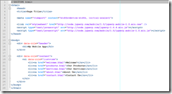
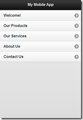
Figure 1 shows the source code for a simple menu rendered in jQuery Mobile. Figure 2 shows what this looks like in the mobile browser. But rather than typing this in, you can simply view the documentation at intl-spectrum.com/s1046 and cut and paste most of this code.
Fig. 1
Fig. 2
Note the line that reads:
<ul data-role="listview">
We can add much more functionality to this menu by adding a couple of additional options to this tag. Note that we're not adding any functional code, just options. For example, let's change this to:
<ul data-role="listview" data-inset="inset" data-filter="true">
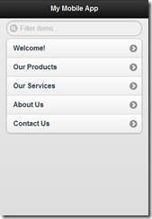
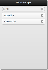
See Figure 3 to see how this renders on the mobile device. The "data-inset" option sets the menu in a little bit from the sides as an accent, and the "data-filter" option adds a search option on top of the menu. Figure 4 illustrates how this search feature works; type in anything displayed in the menu and the menu will filter itself to show you only the options that include the letters you've typed.
Fig. 3
Fig. 4
This is only one of many cool things that jQuery Mobile offers. If you have a spare moment, use your phone, tablet, netbook, e-reader, or even a full fledged computer to browse over to www.jquerymobile.com to see all that this platform can do. And if you want to know more, come to my sessions at Spectrum 2012 where I'll be demonstrating, discussing, and diving much deeper into this amazing new tool!


