Clear Message Initiative
"Danger! Danger!"
This warning was issued frequently from the tinny speaker box of the unnamed robot in the 1960's television series Lost in Space. The message communicates to a limited degree. It does successfully identify the general (dangerous) condition. It doesn't offer any information about the danger or advice about what to do, but the fact that it is a warning about danger is clear enough. It gets a bit better when specifically directed: "Danger, Will Robinson!" Still no indication of what is dangerous or what our intrepid Will Robinson should do about it. But it is more targeted and specific; it is Will Robinson who is in danger. Another oft-quoted warning message from these earliest — albeit science fiction — days of computing was, "Does not compute." This one gets top honors for useless information. It just doesn't get any more vague than that! As the years have passed, there has been much progress in technology, but not as much progress in message clarity. Bad error messages may, in fact, be the bane of the modern world.
Recently I was unexpectedly thwarted in the routine task of syncing my smartphone. An option-less dialog announced, "Function OpenFolder failed." Complete fail. I can venture a guess or two about the cause, using my own programmer expertise, honed deductive reasoning skills, and knowledge of the English language. Some folder has gone missing or corrupted. I wish I knew what might have changed. Or maybe if the message had indicated the name of the folder, or what the program was trying to do, more broadly when it encountered the problem, these clues would have given me something to try before that age-old catch-all solution — delete and reinstall the whole application. How much time do we waste on that particular activity?
Not only is my life filled with cryptic, inexplicable, counter-productive error messages, but I have come to realize that my own software is positively riddled with them! Until recently I guess I figured that getting the software to work was important and reporting when it didn't was not. Nobody reads these messages anyway, was my thinking. They'll call (or e-mail) me. And they do. But this is a self-perpetuating cycle! They might not have to turn to me if the error messages and warning they received made clear sense and offered an alternative.
To be fair to our ancestors, resources were different in the breaking dawn of the information age. Each letter-character required time, effort, and money to display (or print). Options for output were limited. Messages were necessarily cryptic. The limitations are mostly long gone, now, but the culture that had grown up around them has remained. Maybe, to our credit, programmers just like to be efficient. We can probably agree that a common generalization about programmer-types is that we (well, some of you) tend to use words sparingly. Or it may be that programmers have their own language and non-programmers just "don't compute." Certainly users of an application appreciate different things in an error message from what the application's designers may want to know. Many a true geek believes that the classic DOS error message BAD COMMAND OR FILE NAME is a thing of true beauty. It is elegant in its simplicity — and so flexible! It can be applied to such a wide range of circumstances — one size fits all! What it is not, however, is helpful.
So, here we are. You, me, your mom, your kids. Surrounded by fast moving technology that is fraught with errors and very little guidance. If we are going to progress at this rate — as a society, as a nation ,or as an industry — we have got to get better at reporting and explaining failure. And we have to offer guidance that doesn't require translation!
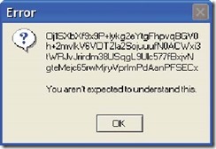
What do we fix in figure 1? Are we, as programmers, lazy? Do error messages fall into the dreaded category of "documentation," to be avoided at all costs? Do we believe that we are somehow protecting our users from knowledge that they can't possibly comprehend? Or are we protecting something proprietary for ourselves? While it is true that keeping things mysterious will help us retain our all-knowing mystique, it will also keep us tied to the phone answering the questions that the error message could have answered.
Fig. 1
When my own error messages are lame, the most likely reason is because I really do have this notion that no one will really need them. I have to put something there; it's just what you do (or there is a mandatory ELSE clause), but I don't really expect anyone to have to rely on the message. Like life insurance — you buy it, but you can't really think about anyone ever really needing it. Yes, I do know that is crazy. And it's not a conscious belief. But I think it governs my behavior to some extent, and I don't think I'm alone in this.
Blogger Harry McCracken theorizes in his Technologizer entry The Thirteen Greatest Error Messages of All Time, that error messages should be painful at worst and boring at best. He contends that, "They tend to be cryptic; they rarely offer an apology even when one is due; they like to provide useless information like hexadecimal numbers and to withhold facts that would be useful, like plain-English explanations of how to right what went wrong. In multiple ways, most of them represent technology at its most irritating. They're rarely helpful. Actually, they usually add insult to injury. But what would computing be without 'em?"
We can joke about it. We can wax nostalgic. An error message from a machine out of your past can transport you back in time. But what we need to do — as a community, as an industry, and as right-thinking humans — is make error messages and warnings better! If we want to provide truly great software — and we do! — but we can't make it flawless — and we can't! — we must make it fail gracefully. We must offer a path to usability even, especially, in the event of a failure. Thus, I contend, the secret to quality software and customer satisfaction is communicating clearly through error and warning messages.
Let's start a revolution! Are you with me?
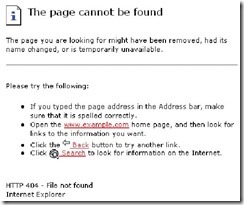
Take a look at the classic example — the http (404) "File not found" error (fig. 2). It is inarguably the most common error message in the human experience. In its early incarnations it was fairly unhelpful (see figure). Grating. Confusing. Negative. Bam! Denied!
Fig. 2
But it was customizable and some enterprising organizations took it further. In fact, if you would like to have a laugh, use Google Images for the phrase '404 File not found' and look at what people have done with the place! (Or go to errorware.com where you can buy clothing with this and other great error messages emblazoned on it!)
So, many web sites offered more polite versions. Some offered more information, included a graphic, a joke, or even a joke graphic. Those organizations have recognized a universal truth that is too often overlooked: when people hit an error and are prevented from doing what they meant to do, they will have an emotional response (and you know the emotion I mean). Throwing in something fun to make the user smile through their pain is not a bad idea, even if it doesn't help the user solve whatever problem they are facing.
A successful error message may or may not include humor, but it should definitely cover these points information:
- The severity: Whether this error critical, fatal, a warning, or just a reminder.
- The problem: what has occurred, what should have occurred, the reasons, and the impact.
- The application layer: what application (or layer) has produced the error.
- The action: What you can do about it right now, how you can find out more, and how you can prevent reoccurrence.
- The challenge is to convey all of this information in a succinct 80 to 200 characters. It isn't impossible. Look what we're doing on Twitter with 140 characters.
87yr ago natl dads: "All equal." War tests. Battle hallowed ground > our words. We vow: dead not in vain, govt of/by/for peeps here 4 keeps
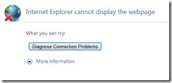
Yes, that was Abraham Lincoln's Gettysburg addressed boiled down to a 140 character tweet. Twitter — and text messaging — have inspired a whole pseudo written language (as well as the dismaying notion of tiny URLS, but that's a topic for another day). These types of shortcuts would rarely be acceptable in a software application's error messages. So, we have to find a way to convey the information briefly but in more formal language, at least for now. This is probably best achieved by using a two part message. The main message text is like a heading. It must be concise, definitive, and structured. It should be instantly recognizable. Then a link, button, or second strike of the function key can take the user to a more elaborate explanation. Going back to that classic "404 File not found" error. Figure 3 shows how it has evolved in Microsoft's Internet Explorer 8.
Fig. 3
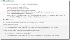
Aside from the questionable graphic where the user is denied the entire earth, this is clear enough and easy to recognize by time you've seen it a few times. It is very general, but its saving grace is the magic "more information" arrow option. That second layer of help is where we can really communicate. Figure 4 is what you see when you click on that.
Fig. 4
This addresses all of the elements, but it has so many maybes that it almost cancels itself out, and it is far too many options for a casual user to absorb. In the time it took to think up and type in all those maybes, at least in our easy-string-manipulation culture, we could have figured it out a bit and at least limited the choices. This is where we (MultiValue/U2 programmers) can use the flexibility of our platform to separate ourselves from the herd. But I digress.
This message is better . But what makes an error message good? Yes, it should have all the pieces of information. But because that information is crammed into a small place and not really going to be read in depth, how it is organized and displayed is going to matter just as much as what it says. These are some starting points that can get the conversation started.
Standardize
There aren't any unified guidelines for error messages. Some application development environments have their own graphics and character-length limits. Microsoft has some general standards. Some standardization with other commonly used applications is helpful to the masses. But what is more important is that a standard be applied within the application.
Recognizable
If there is a main word or phrase that is commonly used it can be instantly recognized and absorbed. "Not on file" or "Required fields missing." Whatever the specifics — and there should be specifics! — that come after, these broader category-phrases will help. Using graphics to standardize the severity or layer of error is a very nice touch if that is available in the platform. Anything that makes it quicker to understand for our human users who understandably have very little patience for error messages.
Layer
We work in complex environments. When something fails, it could be something in our application, something in the application development environment, something in the underlying operating system, something with the network, or even something with the server. That could be the host, the client, or some server in the middle. It is a great help to identify the layer where a problem has occurred in the error message.
Syntax, grammar and punctuation and spelling
For the linguistic sticklers among us — and we know who we are — poor syntax, grammar, or punctuation can feel like the screech of chalk on blackboards. It is simple enough to check a style guide if you are not sure. A small typo can end up preserved like a fossil for all posterity.
Word order, tense, passive vs active
Passive? Nouns first? "Customer name must be alphanumeric." Active, lead with a verb? "Enter alphanumeric customer name." Or passive with the adjective descriptor first? "Alphanumeric is required on customer name field." "Decimals are not allowed in quantity field." Whatever you prefer, if you decide on it and stick with it, uniform error messages will be more quickly parsed and absorbed by the users.
If you use active/directive commands, be careful with the tone. According to some guidelines it is better to avoid accusative or admonishing tones. As rewarding as it might be to say, "You entered a bad name!" you can almost hear "jerk" at the end. Or, "Please don't try to use an alpha character in a date field." Again you can almost hear the exasperated again at the end. Expressing our own frustration as programmers only fosters bad feelings.
Specificity vs Generalization
Reusability is a great concept for development. But when it comes to errors, we must be careful not to generalize so much that our messages become useless. Many applications have been designed with error message databases that can be referenced by number. This can be a boon to standardization and a great way to provide lots more information for that second click. But we run the risk of starting to think of those error messages as precious resources again. Perhaps it feels sloppy to have a lot of similar messages. There are ways to combat the sloppy feeling and address the inefficiencies while still providing useful, specific information (variables in the error message, mainly). Or let go — let it be inefficient underneath so that it can be more useful on the surface! Messages need to offer specific information to the user. What may feel elegant and streamlined to the programmer is not always the most satisfying user experience. Take an extra moment when crafting an error message to see how much information you can give the user about the specific failure in terms that are meaningful to what the user will be trying to accomplish.
Let's start a revolution! Let's look like the best applications out there even when our interface isn't the flashiest graphic. Because even in a green-screen environment, we have the powerful and easy programming language to allow us to do that. If we remember what it is like to be that poor befuddled user trying to sync our smartphone, and if we assume that our error messages will be seen, that they will be needed, we can do better. Above all, let's remember that our error messages are a reflection of ourselves and of the quality of our workmanship!
Linked IN: Want to contribute ideas and suggestions - perhaps gain insight about what others are doing? Join us in the newly created Linked In group "Clear Message Initiative".


